
What exactly is visual hierarchy in website design?
Visual hierarchy in website design is about using some of the most important principles of design to influence the sequence in which our eyes move and perceives the things it sees on a website. In other words, visual hierarchy in website design helps guide a website visitor in a logical progression from most important content on a page to least important content.
Visual hierarchy in website design suggests there is a hierarchical way of placing content visually on a website page. That there is a pecking order to organising and prioritising your content such that some content should be viewed first, some second, some third, and on down the line.
This guide covers how to use visual elements like size, colour, typography, page-scanning patterns etc. to influence the visual hierarchy of content on individual webpages so that presumably, the most important content on that page will be at the top of the visual hierarchy.
1. Size (or scale) hierarchy
When it comes to a webpage, visual hierarchy applies to the sequence in which our eye moves from one piece (or block) of content to another. A good visual hierarchy will help to organize content in a helpful way and leave website visitors with a clear idea of the relative importance of each.
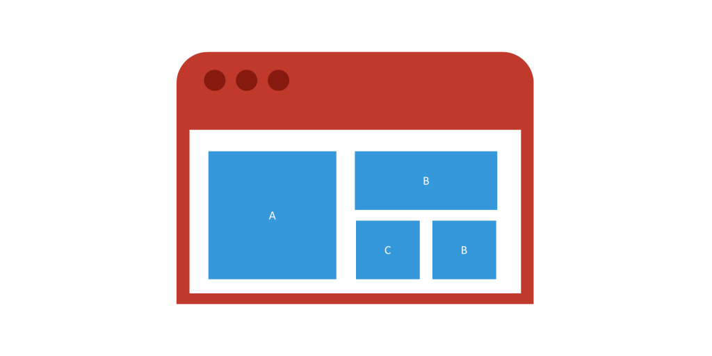
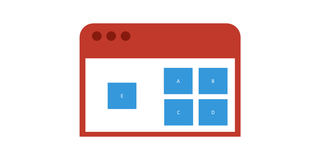
For example, if you were asked to rank the blue boxes above in order of relative importance, without knowing anything about the boxes you’d probably say that the box “A” was the most important given its size relative to the other boxes.
In size (or scale) hierarchy, the most important content is the largest or takes the most amount of space on a webpage, followed by the second most important content and so on. The distinction in sizes should be such that a visitor would view the items in the order of importance, and the pecking order of things is obvious. Enlarging an object’s size (its dimensions) and scale (its size in relation to other objects) is one of the easiest and most effective ways to give the object visual importance.
Visual hierarchy in website design does not only come from size or scale alone. Other design elements like colour, contrast, alignment and typography can be used to make one a piece of content more prominent than others.
2. Typography hierarchy
Typographic hierarchy is all about formatting the typography of your content in such a way that your website visitors can clearly see what’s most important. In other words, having a clear typographic hierarchy enhances the readability and usability of your content.
As a rule, we suggest starting with 3 levels of typography to organise your content around – similar to what you’ll see in a newspaper – with the main headling (or headline), a sub-heading, and body copy.
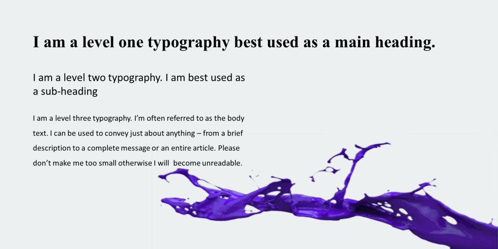
Level one: The heading
Generally, your level-one typography will be the most important content such as the title, subtitle, or topic that stands at the top or beginning of your content, so this should be the most immediately visible typographic element in your design.
Level two: The Sub-heading
Level-two typography usually helps to organize content into sections or to group related information together. They shouldn’t stand out as much as level-one typography, but they should help clearly distinguish different parts of the content.
Level three: The body text
The level-three typography is generally the complete message in the content. It could be long or short. It could be a short note or an entire article. Take care not to use a font size that too small as the content still needs to be highly readable.
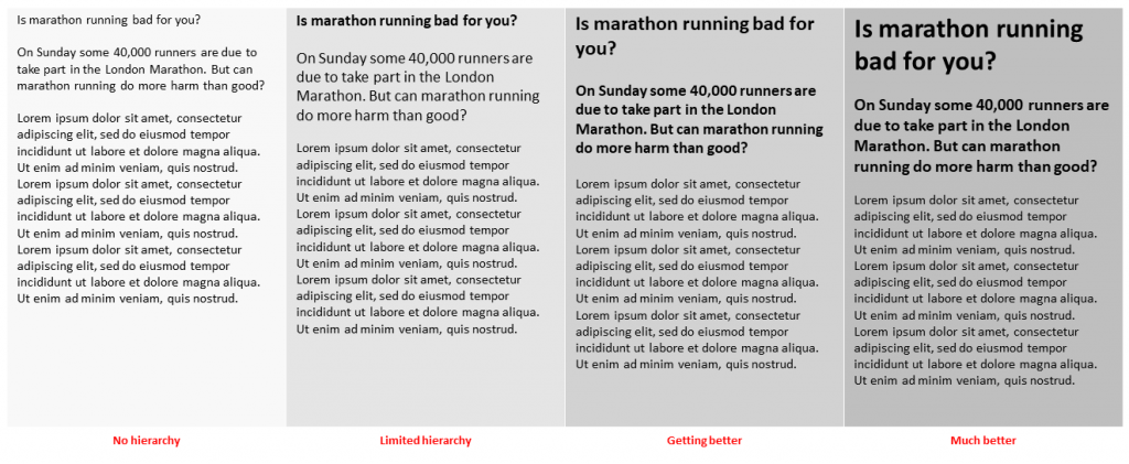
To illustrate the impact of typographic hierarchy on readability, consider the following example using an article from the front page of a newspaper.
3. Visual hierarchy using colour
We’re visually drawn to colour, especially when it’s used strategically to highlight important information. Clever use of a splash of a colour like red or yellow is hard to miss – especially when it is used sparingly.
Colour usage does matter, sometimes a lot. And there is no such thing as a universal colour hierarchy. What works on one website, will not necessarily work on another. It’s not so much about the colour, but whether the important stuff stands out enough.
4. Texture hierarchy
“Texture” with respect to visual hierarchy refers to the overall arrangement or pattern of space, text and other detail on a page, and it can be used to create exciting, often unusual, and even unexpected visual hierarchies. It is about varying the characteristics of your website content in such a way that it influences whether your website viewer will be attracted to the content to a greater or lesser degree.
To some extent, the typographic hierarchy described earlier is a form of textural hierarchy. But textural hierarchy focuses more on composition, and how the content elements are positioned relative to each other.
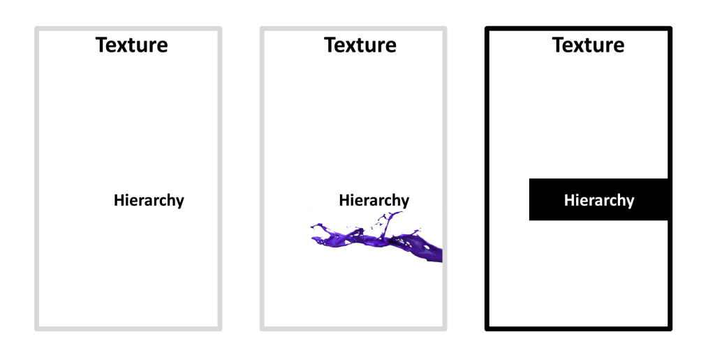
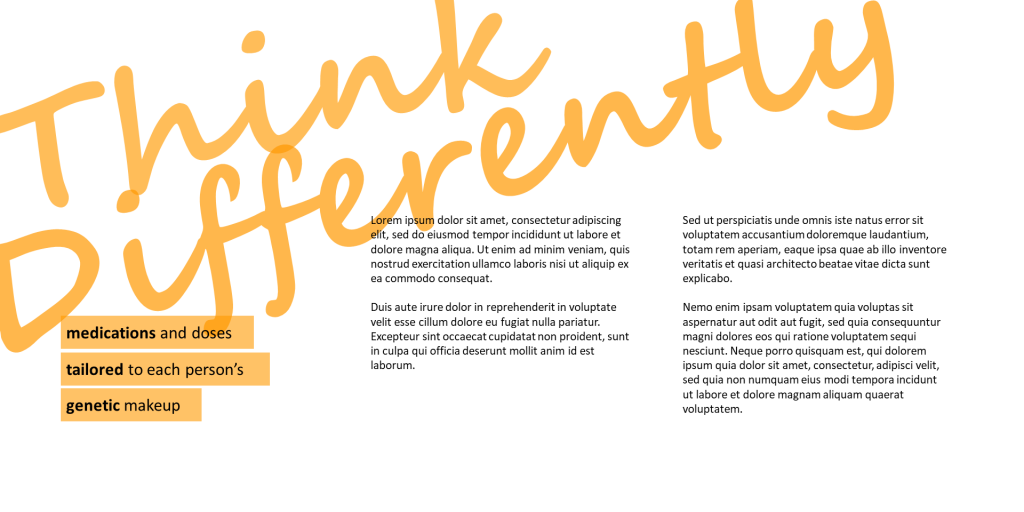
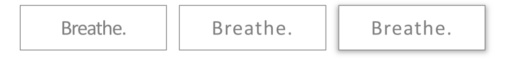
Above are three treatments of the same two words.
Adding an element in close proximity to the second word increases its prominence. Not just because we are visually drawn to the splash of colour, but also because we treat items in close proximity as one block – so in this example, the word “hierarchy” and the splash of colour come together to form a content block that is much larger than the word “Texture” on its own.
Even simply inverting the word “hierarchy” to create a content block that is larger than the word “Texture” increases its level of prominence.
5. F-pattern design and visual hierarchy
The western convention of reading from left to right and top to bottom is an extremely valuable way to achieve visual hierarchy. Here, we are relying on the Western viewer’s instinctive response to return to the left edge.
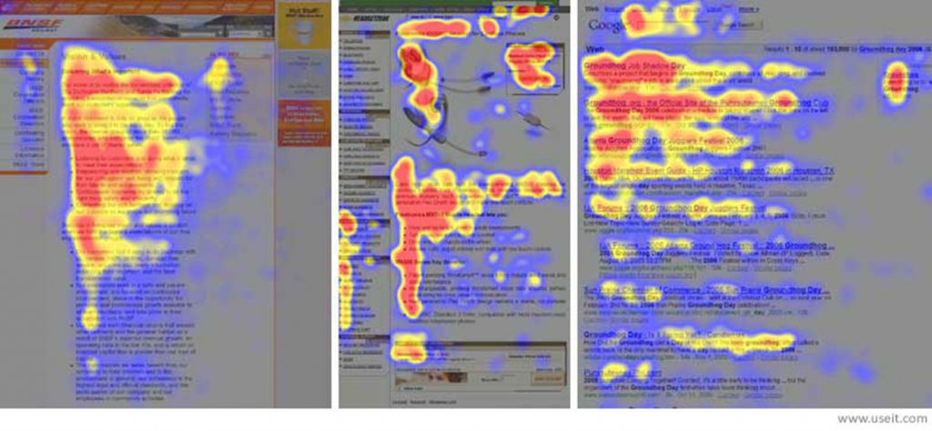
Above are heatmaps from eye tracking studies of three websites carried out by the Nielson Norman Group. The areas where users looked the most are coloured red; the yellow areas indicate fewer views, followed by the least-viewed blue areas. The grey areas didn’t attract any fixations.
The above heatmaps show how users read three different types of Web pages:
- an article in the “about us” section of a corporate website (far left),
- a product page on an e-commerce site (centre), and
- a search engine results page (SERP; far right).
If you squint and focus on the red (most-viewed) areas, all three heatmaps show the expected F pattern. Of course, there are some differences. The F viewing pattern is a rough, general shape rather than a uniform, pixel-perfect behaviour.
Implications of the F-pattern on visual hierarchy in website design
- Users won’t read your text thoroughly in a word-by-word manner. Yes, some people will read more, but most won’t.
- The first two paragraphs must state the most important information, though they’ll probably read more of the first paragraph than the second.
- Start subheads, paragraphs, and bullet points with information-carrying words that users will notice when scanning down the left side of your content.
6. Visual hierarchy with Z-pattern design
Closely related to the above, the z-pattern layout suggest visitors on webpages with low amounts of text content will start in the top-left corner of the website page and scan horizontally to the top-right corner, and then diagonally to the bottom-right before finishing with another horizontal movement to the bottom-right – forming the shape of the letter “Z”.
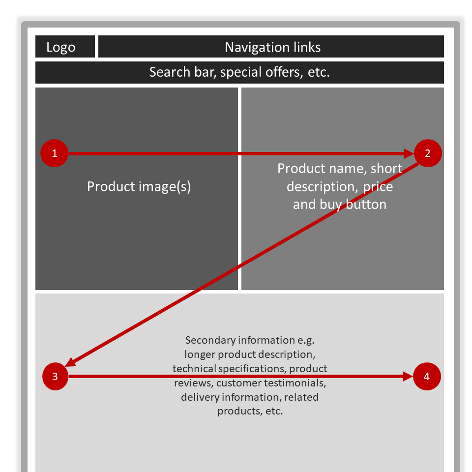
Implications of the Z-pattern on visual hierarchy
We often see this visual hierarchy principle influence the design of product pages on ecommerce websites. You too can make use of this page scanning pattern by including the most important information along the Z-pattern the eye movement follows.
7. Numbers and visual hierarchy
According to research carried out by the Nielson Norman group, website visitors will typically locate numerals while skipping past words. This is because the shape of a group of digits is sufficiently different from that of a group of letters to stand out to users’ peripheral vision before their foveal vision fixates on them. For example, 2514 looks visually different than four even though both consist of 4 characters.
Here are some guidelines for enhancing the visual hierarchy of numbers on website pages
- Write numbers with digits, not letters i.e. 25 not twenty-five.
- Use numerals even when the number is the first word in a sentence or bullet point.
- Use numeral for big numbers (up to millions) for example 2,000,000 is better than two million.
- Use numerals for the significant digits and write out the magnitude as a word. For example, write 25 billion, not twenty-five billion or 25,000,000,000 (most people can’t interpret that many zeros).
To de-emphasise the visual hierarchy of numbers – for example, numbers that don’t represent specific facts – simply spell them out.
8. Use visual elements, visually
It’s a good idea to use images in your website page design; an image can communicate your ideas much faster than text. Even then, it’s important to establish visual hierarchy with and within your image.
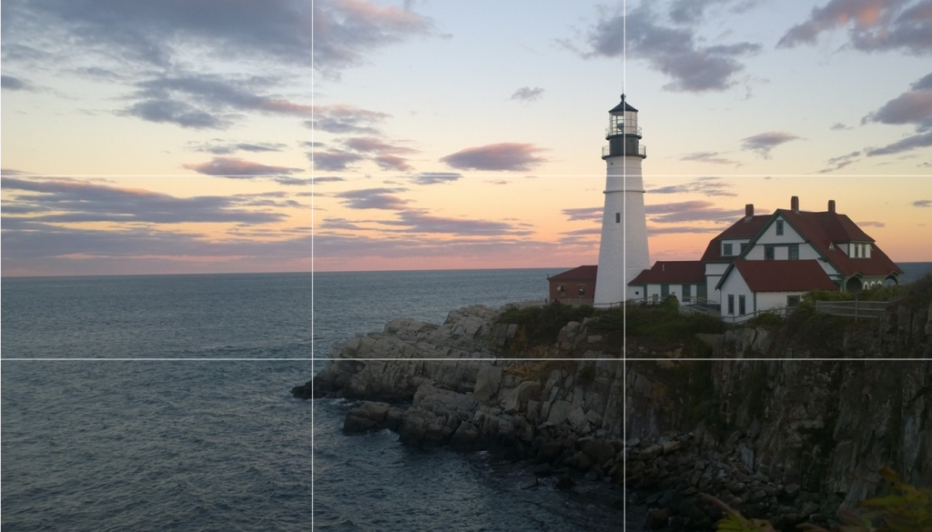
To achieve visual hierarchy within your image, the simplest approach is to follow the rule of thirds. Start by dividing your image into nine equal parts by using two equally spaced imaginary horizontal lines and two equally spaced imaginary vertical lines, and then place important compositional elements along these lines or their intersections as shown in the example above.
To establish the visual hierarchy of your image on a website page, simply experiment with the size of the image to enhance (or reduce) its visibility based on the size hierarchy principles described earlier.
9. White space and visual hierarchy
In a study by Google in August of 2012, researchers found that not only will users judge websites as beautiful or not within 1/50th – 1/20th of a second, but also that “visually complex” websites are consistently rated as less beautiful than their simpler counterparts. In other words, the study found that the simpler the design, the better.
Visual hierarchy in the simpler websites was attributed to an important design element – white space.
White space (also called ‘negative space’) is the portion of a website page that is deliberately left “empty”. It’s the space between graphics, margins, gutters, space between columns, space between lines of type or visuals. It can be any colour, not just white. The basic idea is, the more white space surrounding an element, the more attention it will attract.
White space makes it easier for users to comprehend the information provided on the web page – this can include headlines, images, CTA buttons, or links to valuable content. It also helps to divide the web page into several distinct parts or areas, which in turn makes it simpler to process and digest the content.
Remember the blue boxes from earlier on, in this example, all the blue boxes are now the same size. Applying the principles of visual hierarchy in website design, which blue box stands out the most, and why?
In conclusion
Every element communicates subtle information
When designing with visual hierarchy in mind, it’s important to bear in mind that every element – typography, logo, colour, spacing, etc. – communicates subtle information about the importance of that piece of content relative to other elements on the website page. Visual hierarchy is about optimizing a website page for visual information processing.
So there it is. All you need to know about visual hierarchy in website design. Why not try ranking the content on your website pages based on your business objective, and then check if something important is not high enough in the visual hierarchy. If what you want to stand out visually is not, then perhaps it’s time to go back and make some revisions using one (or more) of the principles presented in this guide.